Whether starting a new database or renovating an existing application, Access Form Design is one of the most critical steps in development. Done right, your forms deliver a highly productive, professional experience that boosts user confidence and eliminates input errors.
Modernize Your Background Color
Older versions of Access defaulted to a dark gray detail background. While typical in early Windows software, dark gray backgrounds immediately make modern applications feel outdated.
The Fix: Open your form in Design View, select the Detail section background, and switch to a crisp white (#FFFFFF) or light neutral background (#F8F9FA). It takes seconds and instantly modernizes your interface.
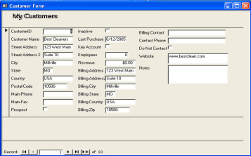 Dated Gray Style
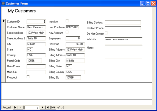 Clean Modern White
Consistent Font Use & Visual Hierarchy
Visual clarity is determined by how quickly users can process screen information without cognitive fatigue. When labels mix random font families, sizes, bold weights, and underlines, users are forced to filter visual noise before finding target inputs.
Key Typography Guidelines:
- Font Weight & Underlines: If every label is bold, nothing stands out. Avoid underlining text labels entirely, as users associate underlines with clickable hyperlinks.
- Single Font Family: Standardize across your entire form on modern sans-serif typefaces like Segoe UI, Calibri, or Arial.
- Controlled Sizing: Standardize body inputs and labels to 10pt or 11pt. Reserve larger sizes strictly for primary section headers.
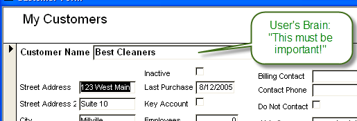 Click to view font sizing structure
Indicating Required Fields:
Prevent validation errors before users submit by making mandatory fields obvious:
- Use bold styling exclusively for required field labels.
- Append a subtle red asterisk (*) adjacent to mandatory input labels.
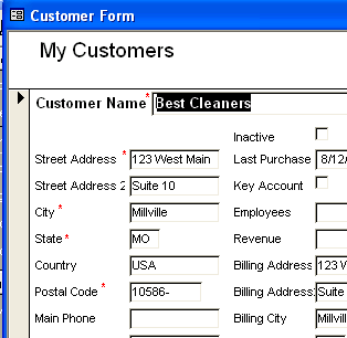 Required field indicators
Logical Groupings and Precision Alignment
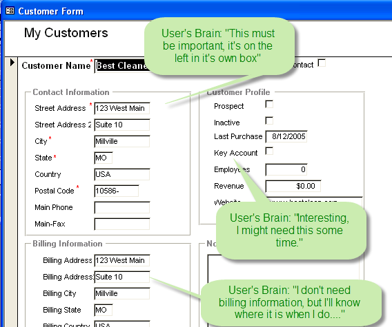
Misaligned text boxes and scattered controls undermine application credibility and slow down keyboard navigation. Grouping related inputs gives users immediate context.
Grouping Related Controls:
Use lightweight border rectangles or Option Group Frames to segment forms into logical blocks (e.g., Billing Address vs. Shipping Details). Pro Tip: Add an Option Group Box and click cancel on the wizard to create a labeled grouping frame without radio buttons.
Alignment Tools:
Select multiple controls in Design View and leverage the built-in Arrange > Align and Size/Space tools on the Access Ribbon to ensure uniform grid alignment.
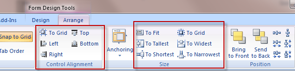 Ribbon Alignment Tools
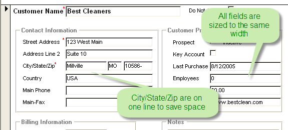 Aligned Result
Intuitive Navigation Structures
Clear navigation gives users context of where they are and prevents accidental tampering with underlying tables. Several approaches exist in Access:
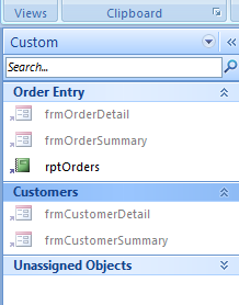
1. Navigation Pane Custom Groups
Organize objects into Custom Groups to prevent casual users from getting lost among system tables and backend queries.
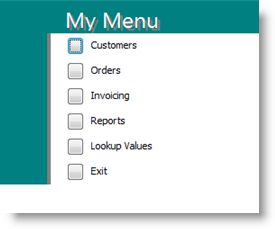
2. Switchboard Manager
A built-in hierarchical menu system. Simple to configure, though visually dated and limited to 8 actions per screen without VBA.
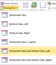
3. Access Navigation Forms
Introduced in Access 2010 to offer horizontal and vertical browser-style tab layouts directly on the Ribbon.
4. OpenGate UI Builder Framework
A menu and UI framework that replaces switchboards with dynamic menus, multi-level security, and audit logging.
Learn About UI Builder »